
Writer Chloe Lane interviews artist Ella Sutherland

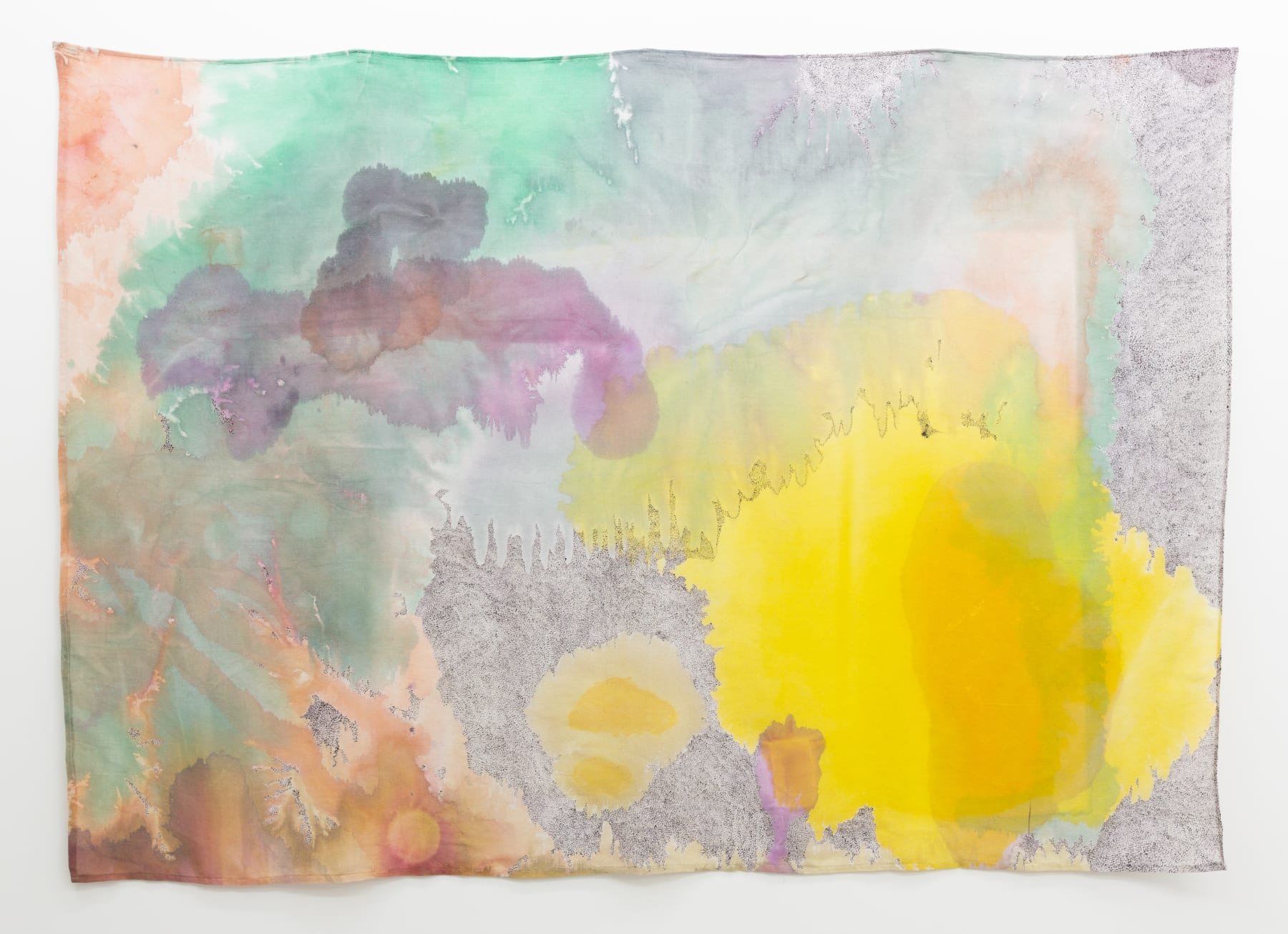
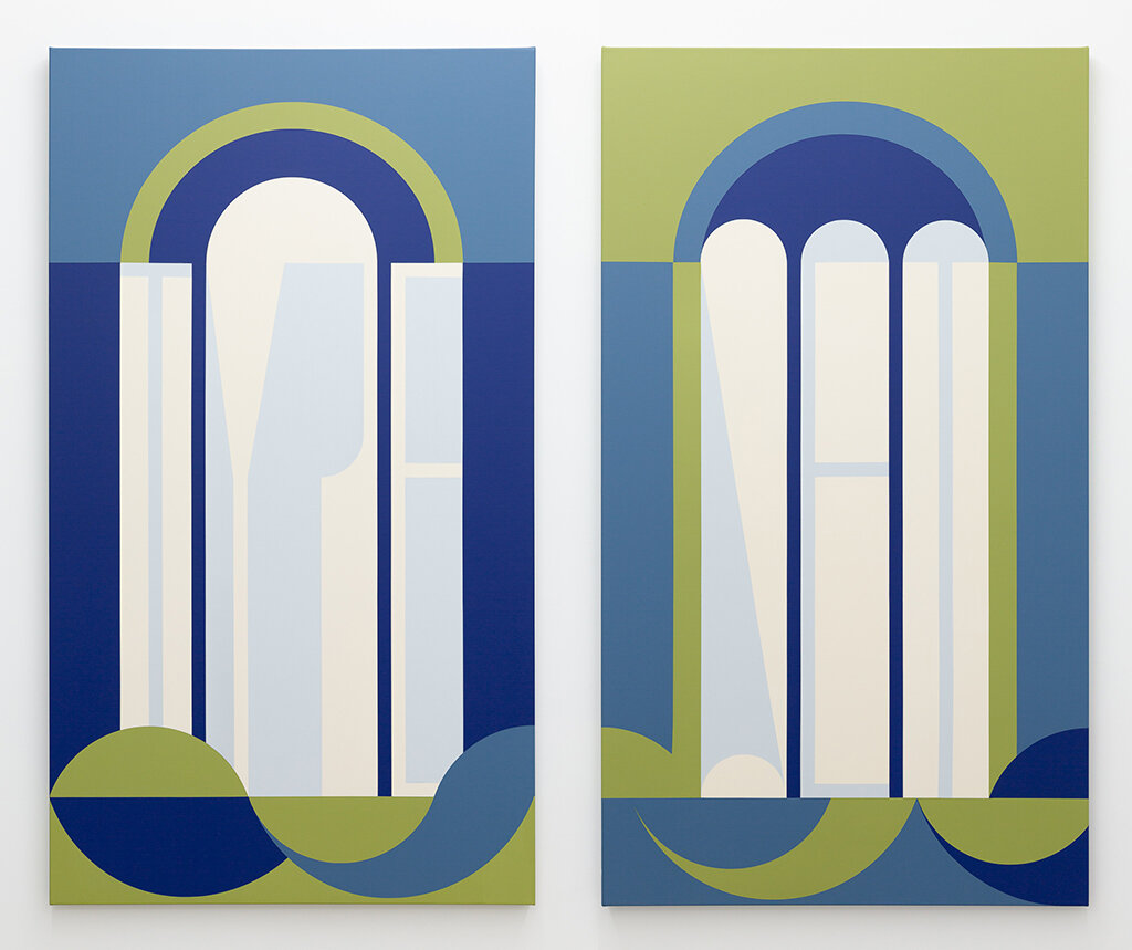
Ella Sutherland, Body Language (Type Set), 2020, acrylic on linen, two panels: 152.5 x 86.5 cm each; 152.5 x 186 cm overall. Courtesy of the artist and Sumer

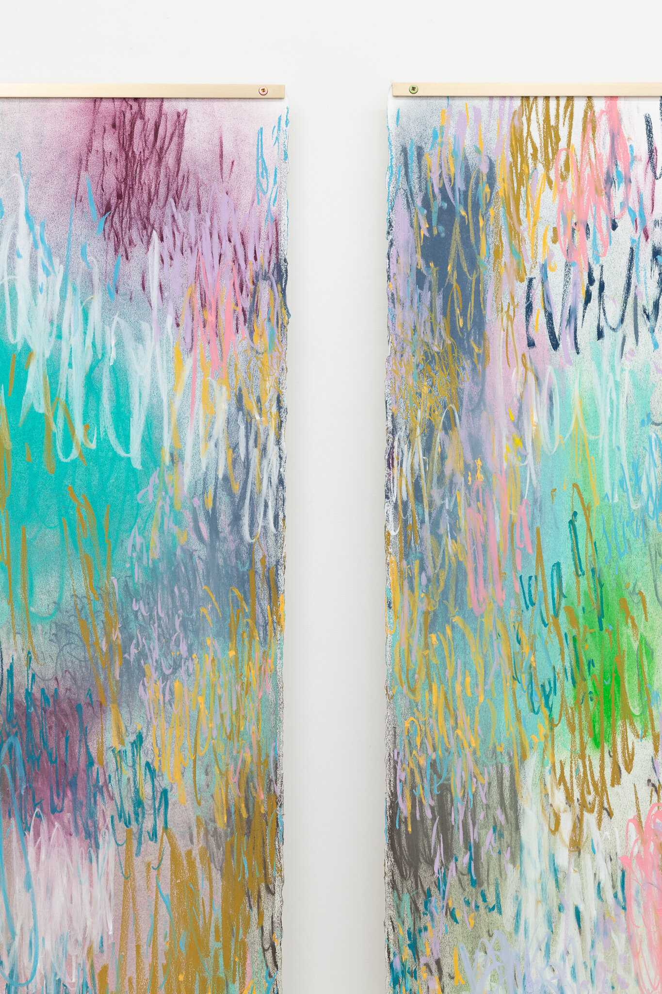
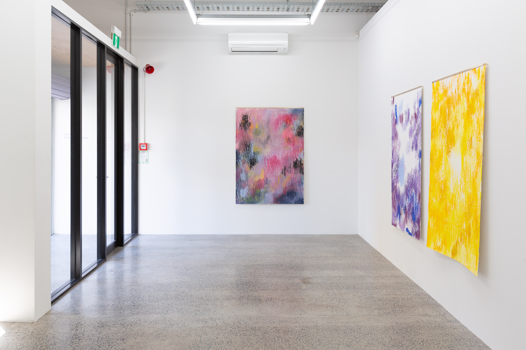
Ella Sutherland, FOLDS. Installation view, Sumer, November 2020. Courtesy of the artist and Sumer
The cool, sharp-edged abstract paintings in FOLDS, Ella Sutherland’s newest exhibition at Sumer, Tauranga, are miraculous icebergs supported by a deep foundation of intensive reading and writing. As of this month, Sutherland should be starting her Creative New Zealand Visual Arts Residency as the artist-in-residence at the Künstlerhaus Bethanien, Berlin and a year of intensive making and research into the social and political climate of Germany in the 1930s. Instead, she is still in Sydney, where she has lived and worked since 2016, and where the paintings in FOLDS were created.
These paintings are architectural in form and scale. Though theirs is an architecture looking for human forms, an architecture of intimacy: doors, windows, staircases, screens. Sutherland spoke to Chloe Lane about some of the research that supports these works, in particular her interest in the non-heterosexual spaces—architectural, literary and social—of early 20th century Paris, her belief in the innate rhythm of letterforms and texts, and what she thinks can be gained by acts of refusal and looking backwards.
Chloe Lane: The paintings in FOLDS visually engage with architectural elements. Place Holder (Act) (2020) and Place Holder (Class) (2020) have been installed side by side at Sumer and considering their scale—both stand at 152 cm—there’s a desire to read them as a pair of arch windows. Yet they could also be viewed as folding screens, glass doors, or the ripples of heavy curtains. So are they something to look through, or to conceal, or both? Can you talk about how architecture, particularly the architecture of interior spaces, is depicted in these works?
Ella Sutherland: During the early 20th century ‘built space’ was increasingly defined by heroic transparency and its ability to communicate modern architecture’s ‘clear view’. The architecture that informs FOLDS, while designed during the same period, replaced an ambition for clarity with refusal. The process of deciphering, or learning how to read the complexity of these spaces could be said to echo the politics of non-heterosexual visibility at the time. Eileen Gray’s architectural practice, the language of writer Djuna Barnes, and Natalie Clifford Barney’s literary salon are each referenced as spatial precedents which offer an alternative to the dominant mode of built, written and social space.
The paintings in FOLDS employ obstruction as a compositional constraint, placing the viewer at the threshold of a private, concealed or ambiguous scene. Gray described her practice as being based on the pleasure and power of suggestion, on objects and domestic spaces that secured privacy and held mystery. In this instance, the partial view can also be read as a metaphor for transgression. The idea of designing for decoding, or for that which will only be partially revealed, informs the way I have depicted this boundary: curtains of letters, table-like columns, folding language, hidden stairs, sliding doors, windows, and pages as screens. The paintings position the viewer both inside and outside, a gesture to the blurring of space embraced by the historical references, and to the ongoing fluidity of identity politics.
Eileen Gray’s (1878–1976) villa E-1027, built in the south of France from 1926-29, was designed as an intimate, highly personalised holiday house for Gray and her lover at the time. ‘E-1027’ was their names in code. Can you talk more about Gray’s influence on these works, particularly her interest in how architecture can and should support a living space as private, intimate?
Figures like Eileen Gray, who lived outside of traditional heterosexuality, were not yet clearly recognisable or identifiable in terms of language during this time. Jasmine Rault, the author of Eileen Gray and the Design of Sapphic Modernity: Staying In (2011), suggests that this played a role in their representational strategies; to obscure and straddle the line between revealing and concealing what was increasingly seen as deviant desire. E-1027 presented an architecture for the kind of subjects who were otherwise denied an appropriate living space.
Gray’s resistance to visibility and her emphasis on intimacy suggest her sensitivity to the gendered and sexualised politics of the time. Hidden alcoves, moveable walls, or private rooms were not simply working against the ‘free plan,’ but accommodating the ambiguous bodies and desires deemed a threat to modern ambition. Gray’s aversion to dismissing the body in her designs is suggested by her articulation of the ‘living-room’ as a space made for intimate and private life. She was interested in encompassing, as opposed to suppressing, living. The diptych Neither Window or a Wall, 2020 reproduces the name ‘E-1027’ across the sections of a folding screen—the folding screen was an object Gray used repeatedly in her designs. Formed in concert with the angles of the panels, the letters and numbers in the painting lose legibility and drift toward decoration—the counters of the language appearing window-like. The bodies of the letters also become fractured—not dissimilar to the nature of a folding screen as a wall.
Letterforms are evident in a number of these paintings. In the diptych Body Language (Type Set) (2020) the words ‘type’ and ‘set’ are clearly visible. The paintings in Letters, your previous exhibition at Sumer, also used letterforms. As discussed in Elle Loui August’s exhibition essay (April 2020) these earlier abstractions utilised these forms to illuminate the personal correspondences between three literary figures—Emily Dickinson, Virginia Woolf, and Gertrude Stein—and their female ‘confidantes.’ What role do letterforms play in these new works? And are there similar literary influences?
My practice has a long-running interest in how language is made visible. Johanna Drucker’s writing on the multiple ways in which a letter is a product of, and is densely coded with, its surrounding contexts has informed my approach to language as being both a system for communication and a formal artefact able to be deployed as autonomous form. The idea that letters at their most expansive are poetic instruments blending conceptual and material conditions is something that very much informs the way that I look at, and work with, language.
FOLDS conflates an interest in both the architectural potential of letterforms, and the use of language in Djuna Barnes’ 1936 novel, Nightwood. Known for its indirect approach, Barnes’ blending of literary styles offered an alternative to modern literature, an impenetrability comparable to Gray’s ‘protective’ architectural layers. Nightwood’s non-representative, decadent manner contributed to the formation of identities not yet accommodated by early 20th-century practices. It was complex, private, and dismissive of fixed representation. Woven tightly into the composition of the paintings, the letterforms that appear throughout FOLDS resist immediate reading, creating a prolonged route to the interior of the work. The paintings tease out the possibilities of legibility to conjure the opaque logic of Nightwood’s narrative or Gray’s obstructive use of façade.
The paintings have an immediate visual impact. The colour palette—cool blues, mossy greens, a deep brown-red—is limited and tightly controlled. Despite the flatness of the paint application there is also a sense of depth. Has your work as a graphic designer influenced these formal choices?
A connection could be made between the use of a reduced set of visual forms in the paintings and the creation of a typeface. The process of forging letters always reminds me of their malleability, how we as readers have a great ability to find a rhythm, order or text in abstraction. The repository of shapes I begin with all contain very simple geometric forms, not dissimilar to those underlying the Latin alphabet. I also design books, a practice which filters through to the proportions I work with, how I approach a composition and the way I think about seriality. Creating publications often requires a certain logic to ensure it functions as a cohesive experience. I also see similarities between this and my use of a tightly controlled palette.
Working with pages has also encouraged my interest in the spatial relationship between print formats and built space. I make reference in Place Holder and Body Language to Canon Tables—the visual structures used in Gospel manuscripts to identify parallel passages between the four Gospels. As was tradition in medieval manuscripts, the Tables were often arranged in architectural frames. This early example of language within architecture resonated, especially after seeing Natalie Clifford Barney’s map of salon attendees weave around a sketch of her garden temple. A feminist, writer, and poet, Barney’s weekly literary salons were held in a small Doric temple at the back of her Paris home from 1909 to 1968. Barney’s salon was pivotal in this sense in that it shifted the character of an already built architecture through the repeated, furtive, gathering of bodies. The salon provides a conduit to think through the ways in which the built environment plays a role in the construction of identity, and how use and actions within that environment may shape the architecture itself.
Another continuing interest of mine has been the relationship between the hand and the machine in sharing thought, embracing both the similarities (scribe or sign writer trying to be as machine-like as possible) and differences (the essential inability of the hand to engage the endless repetition basic to mechanisation). The “Letters” series made a very direct connection between painting and the medieval scribe, and while FOLDS is less tethered to a specific history, the methodical way I make a painting takes a similar structure to that of making a print. Just as I am drawn to any movement that may occur at the threshold between plate and paper, I am curious to see what mis-registration may be prompted by my humanness.
The architectural, social, and literary spaces that influence these works were all produced by non-heterosexual figures in 1920-30s Paris. Collectively, how do these queer histories activate your contemporary practice? What is to be gained from looking backwards in this way?
While the impulse is often to focus dialogue around queer subjects as one of longing for a future community, I am more interested in the visual, written and social consequences of their turning away; what space is made with a retreat from the future. As opposed to disowning these minor histories, I want to consider how they continue to influence our experience and make visible what shifts have, and haven’t, occurred. I cite Heather Love’s book Feeling Backward (2007) as a key text to reflect on the contemporary reverberation of such backwardness. Love suggests that our social, cultural and political systems need to incorporate the damage they hope to repair because in most instances, the structures addressing inequalities of power have nothing in common with the experience of powerlessness.
By attending to histories constituted through refusal, I hope to step away from grander notions such as pride, to trace a record of making that doesn’t posit explicit activism at its core. While less likely to spur revolution, they may offer insight to the temperature or contour of a situation. Taken together, these experiences illuminate backwardness as a key to modernity’s others. The splicing of these narratives teases out the possibilities of a queer historical structure and reflects on what it means to embrace a legacy of damaged or refused agency.

Ella Sutherland, Neither Window or a Wall, 2020, acrylic on linen, two panels: 152.5 x 173 cm overall. Courtesy of the artist and Sumer

Ella Sutherland, Place Holder (Class), 2020, acrylic on linen, 152.5 x 86.5 cm. Courtesy of the artist and Sumer
“A connection could be made between the use of a reduced set of visual forms in the paintings and the creation of a typeface. The process of forging letters always reminds me of their malleability, how we as readers have a great ability to find a rhythm, order or text in abstraction. The repository of shapes I begin with all contain very simple geometric forms, not dissimilar to those underlying the Latin alphabet.”

Ella Sutherland, FOLDS. Installation view, Sumer, November 2020. Courtesy of the artist and Sumer

Ella Sutherland, FOLDS. Installation view, Sumer, November 2020. Courtesy of the artist and Sumer

Ella Sutherland, As in the Tide: Pleats, 2020, acrylic on linen, 122 x 91.5 cm. Courtesy of the artist and Sumer

Gallerist Dan du Bern of Sumer on Hikalu Clarke’s current exhibition at the gallery.